
Four years ago, OpenAI demonstrated a new AI capability called “outpainting” by extending Johannes Vermeer’s Girl with a Pearl Earring beyond the edges of the original canvas.
At first glance, the result is astonishing. The colours, light and atmosphere looked convincingly Vermeer-like. Look a little closer, though, and things start to unravel. A kitchen cabinet seems to have a disappearing wall behind it. Shelves sit at odd angles. Objects don’t quite line up. And on the right is a mysterious red lantern with a handle or wall mount that doesn’t appear to be quite either.
AI image generation has advanced enormously since then, so I assumed outpainting must have improved too. I decided to test it by taking some of New Zealand and Australia’s most recognisable paintings and asking AI to extend them beyond their original frames. The idea was to reveal more of the scene: what lies further down Collins Street, what sits beside Robin White’s Mangaweka building, or what the rest of Hill End might look like beyond Russell Drysdale’s cricketers.
I expected to end up with some remarkable images. Instead, this became a project in frustration.
Roads suddenly changed direction. Buildings grew or shrank between prompts. Train tracks went nowhere. Horizon lines disagreed with themselves. Vehicles appeared on footpaths. Pedestrians wandered directly in front of trams. Fixing one problem would often create two new ones somewhere else. At times, it felt less like the original artist had extended the painting and more like M. C. Escher had been brought in as a consultant.
Eventually I gave up trying to make them perfect. The failures were becoming more interesting than the successes. So here they are.
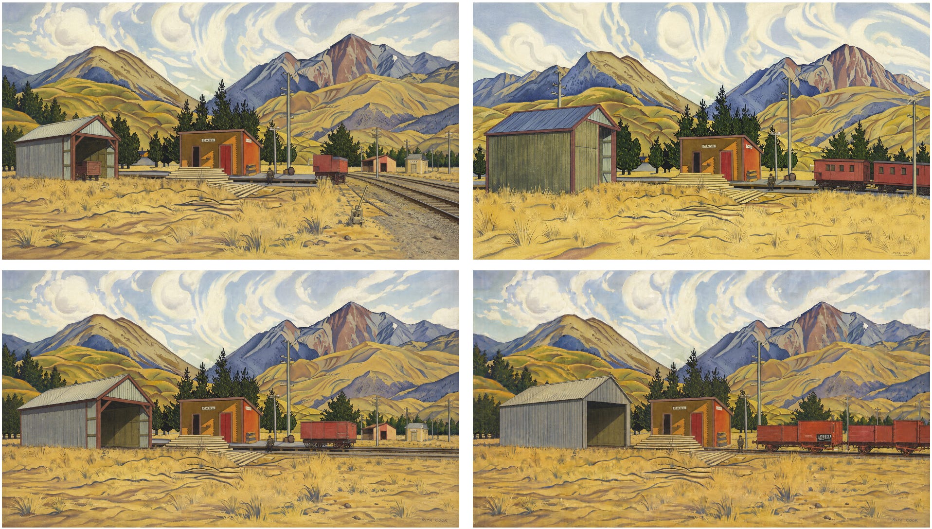
Rita Angus, Cass
The mountains and sky are surprisingly convincing. AI captures the sparseness of the Canterbury landscape and comes reasonably close to Angus’s palette and treatment of the background.
Then you look at the railway station and foreground. The shed starts to lose its perspective as it extends beyond the original painting, while the carriages and train on the right seem to be following several entirely different interpretations of where the railway tracks are supposed to go.
It’s an early indication of something I found repeatedly: AI can be remarkably good at reproducing the surface of a painting while simultaneously losing track of the physical space inside it.
The original is at Christchurch Art Gallery.
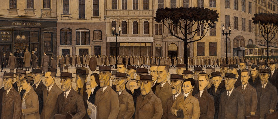
John Brack, Collins St, 5p.m.
I wanted to make a small nod to John Brack’s other famous painting, The Bar, by incorporating a pub somewhere in the background, ideally with the barmaid visible inside. AI obliged by adding Young & Jackson on the left. There is one fairly significant geographical problem and that is Young & Jackson isn’t on Collins Street.
But that quickly became the least of my concerns. Brack’s commuters originally move in parallel streams down the street. Once the pub appears, the pedestrians split around it in completely different directions, effectively requiring a fairly radical redesign of central Melbourne.
On the right, Collins Street now appears to bend around a corner. The tram is a nice addition, although several of the pedestrians may want to reconsider their route home walking directly in front of it.
The original is at the NGV Australia.
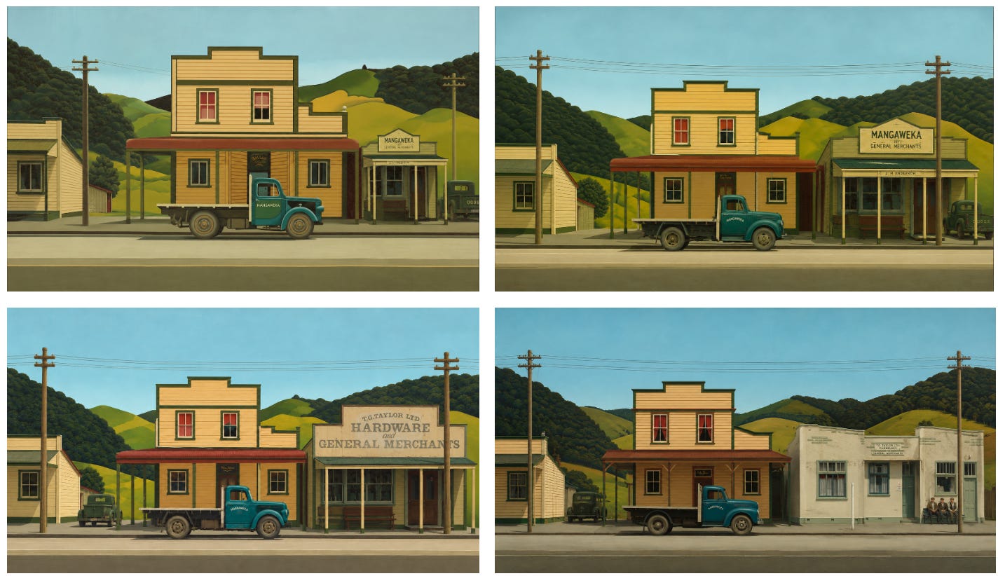
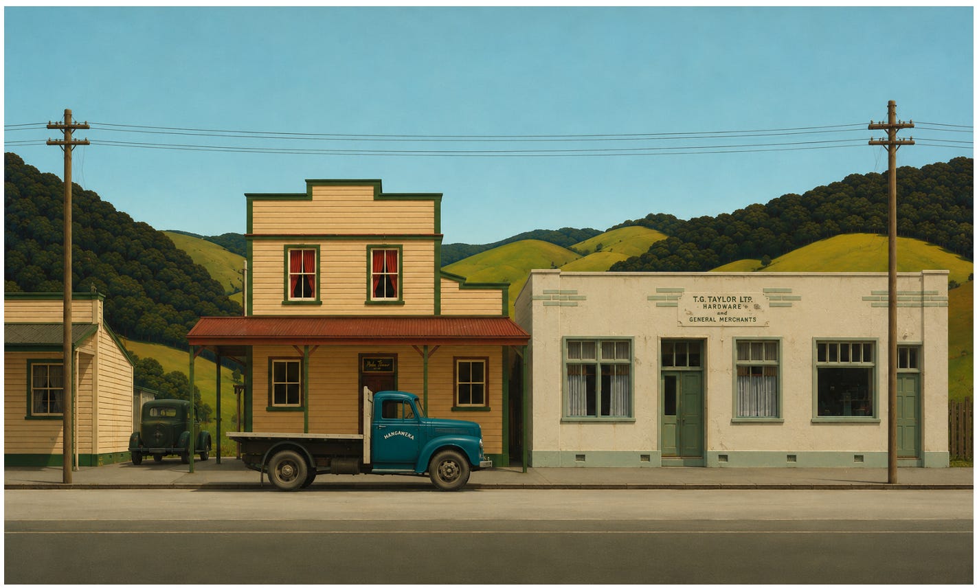
Robin White, Mangaweka
Mangaweka is a small town in the lower North Island, between Taihape and Hunterville. Its former main street has become something of a tourist attraction and, using Google Maps, you can still find the exact building Robin White painted.
That made this an interesting test. Rather than asking AI simply to invent what might sit beside the building, I could give it photographs of the real street.
It didn’t help as much as I expected. The building immediately beside White’s is a relatively modern church, so I found some other historic buildings along the street that seemed more sympathetic to the painting and asked AI to incorporate those instead.
One came out far too small. I added a real historic sign, which initially became enormous, then strangely tiny. I tried another building from across the road and ran into the same problem.
However, even when AI knew what the building should look like, it struggled to understand how large it should be in relation to everything already in the painting and often misinterpreted perspective lines as the actual direction of the store front.
The original work is at Te Papa.
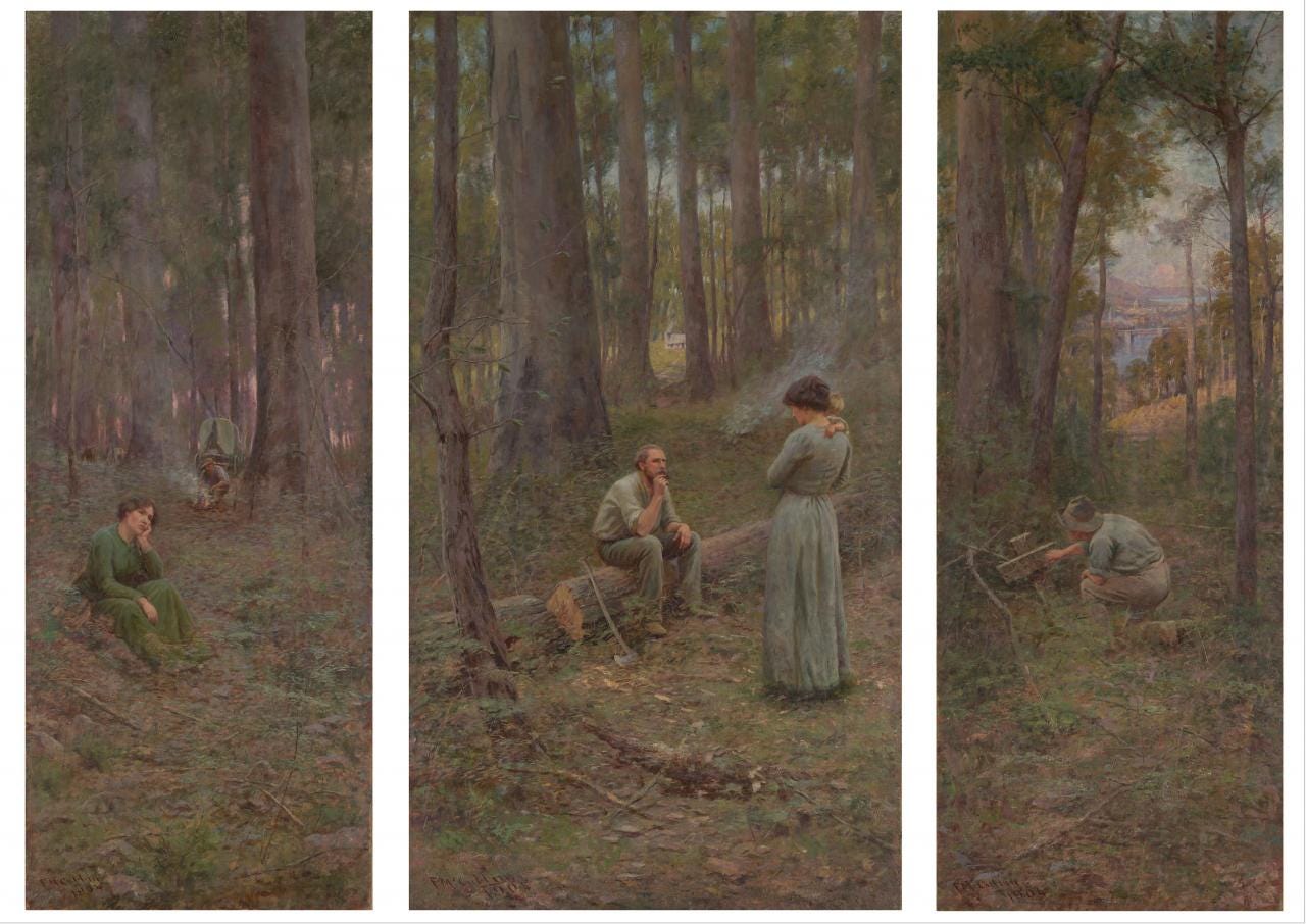
Frederick McCubbin, The Pioneer
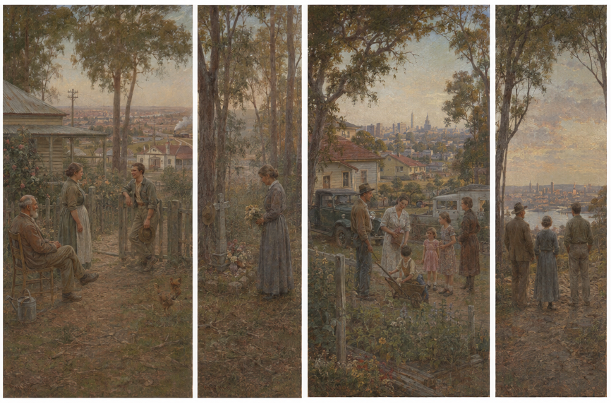
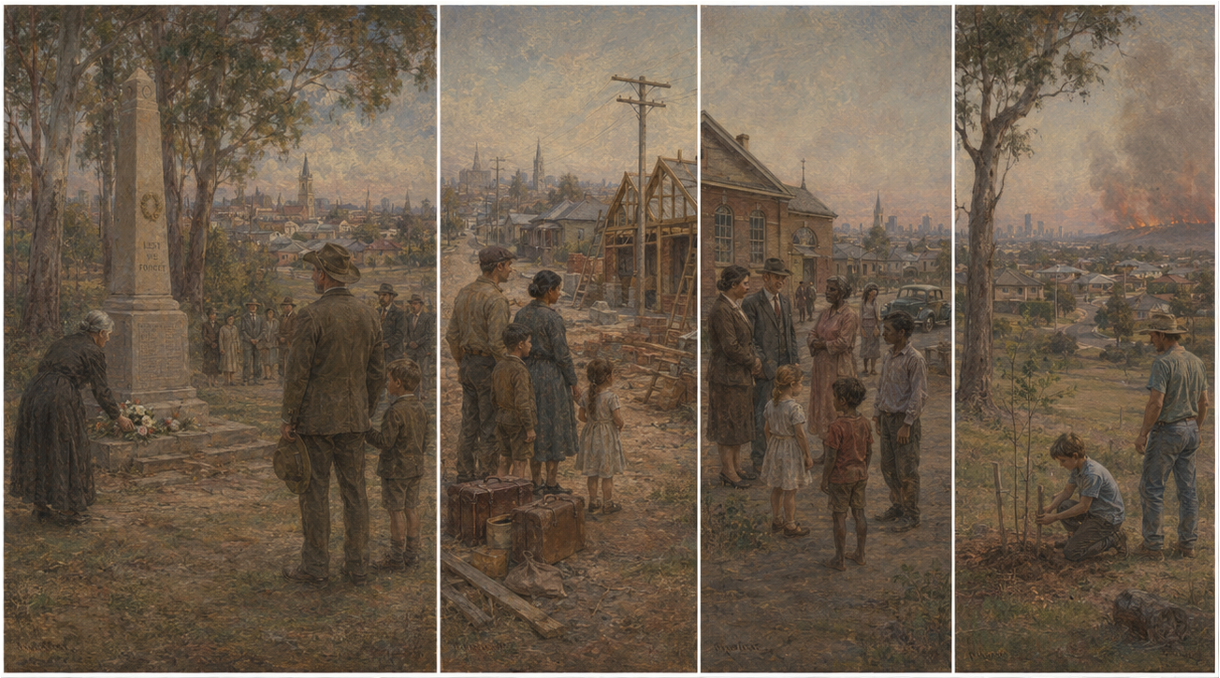
Frederick McCubbin painted The Pioneer in 1904, just after Australian Federation. The three panels tell a story of settlement and national identity. But Australia’s story obviously did not end there. So rather than simply extending the scenery, I asked AI to imagine what additional panels might look like if the narrative continued through the 20th century and into the present.
It suggested themes including sacrifice and remembrance through the world wars, postwar immigration, greater recognition of Aboriginal history, multicultural Australia and, finally, themes around stewardship of the land and climate change.
The two versions below were the result. Visually, I think these are among the more convincing experiments. AI gets surprisingly close to McCubbin’s tonal palette and hazy treatment of the Australian bush.
The narrative is more difficult as the original triptych condenses a complicated national story into three deceptively simple images. Adding another century of Australian history without turning the work into a checklist of worthy themes is much harder and certainly needs further refinement.
The original is at the NGV Australia.
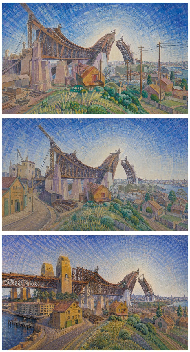
Grace Cossington Smith, The Bridge in-curve
This one of Grace Cossington Smith’s bridge got wacky very quickly. The challenge was to extend the scene while keeping the bridge, roadway, harbour and surrounding city structurally coherent.
AI had very different interpretations of what the construction should look like. In one version, construction seems to start above the Rocks and extend in both directions. When I pushed it to resolve that problem and complete the roadway, it did so, but apparently decided Sydney Harbour itself also needed redesigning.
Another interesting twist is the evolution of the sky. Cossington Smith’s blocky strokes become increasingly geometric as the image expands, until they almost resemble mosaic tesserae. Whether that is a faithful extension of Cossington Smith or the beginning of an entirely different painting is another question.
The original is at the NGV Australia.
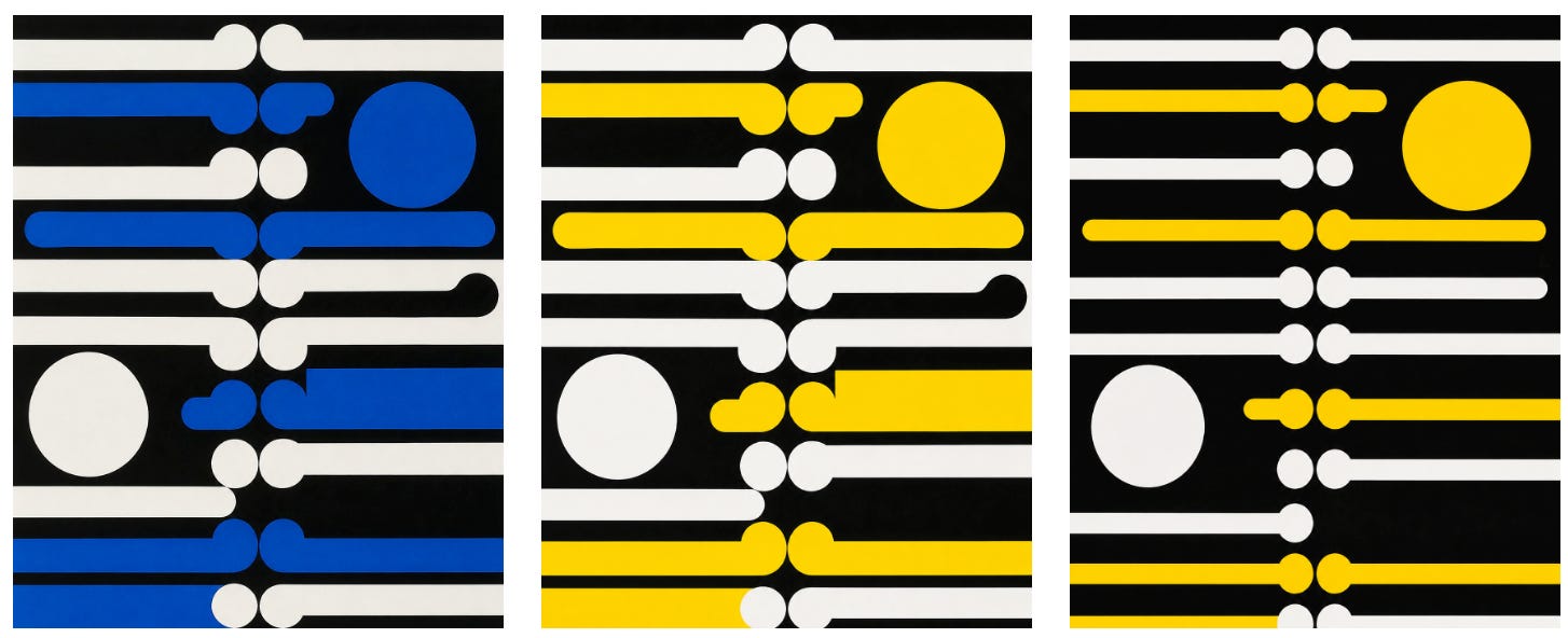
Gordon Walters, koru paintings
With Gordon Walters, I tried something different. Rather than outpainting an existing work, I wondered whether AI could create a new image inspired by the strong repetitive geometry of his koru paintings.
There is obviously nothing particularly new about artists responding to Walters. One of my favourite examples is Marian Maguire’s Boogie Woogie with Gordon Walters, which she describes as a play between the works of Walters and Piet Mondrian.
Maguire was considerably more successful. The AI images below developed from left to right. The first and second at least capture the elements of the koru but then it dissapears into something closer to generic Op Art.
Russell Drysdale, The Cricketers
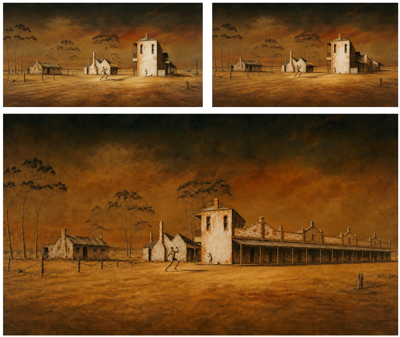
The Sydney Morning Herald has described The Cricketers as “possibly the most famous Australian painting of the 20th century”. The scene is set in Hill End, an old gold-mining town in central New South Wales. I wanted to see what more of the town might look like beyond Drysdale’s famously sparse composition.
The extension on the left works reasonably well. The trees, open landscape and small farm building sit fairly naturally within the painting.
The larger buildings on the right, however, never quite find the right scale or perspective. After several iterations, I somehow ended up with an improbable row of houses advancing diagonally away from the viewer as though Hill End had undergone a particularly poorly planned subdivision.
The original, according to Wikipedia, is now owned by JGL Investments, a Melbourne-based investment company.
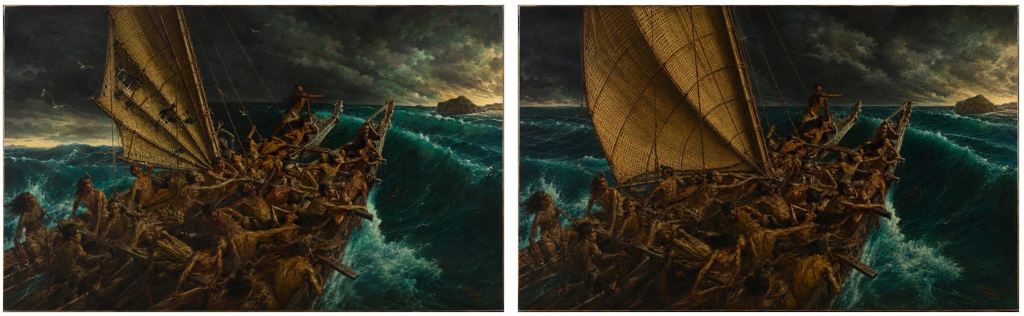
Louis J. Steele & C. F. Goldie, The Arrival of the Maoris in New Zealand
At first glance, this may be one of the most impressive. The treatment of the sea, sky and figures is reasonably consistent with the original painting, and I like the addition of land appearing in the distance on the right.
Then look at the horizon of the painting on the left below. On one side of the sail it sits noticeably lower than on the other. The waka presents another structural challenge. Follow it towards the stern and it appears to divide into two separate vessels.
I asked AI to fix the horizon. It did — but in the process also restored part of the sail, which those Māori sailors might have appreciated but rather defeats the point of preserving the original painting.
I am mildly surprised that, somewhere along the way, it didn’t add a Moana-like character steering the waka.
The original work is at Auckland Art Gallery.
What I learned
What surprised me most was the gap between AI’s ability to imitate an artist’s style and its ability to understand a painting as a coherent physical space.
It can reproduce colour, texture, atmosphere and brushwork remarkably well. But ask it to maintain a vanishing point, extend a building at the correct scale, preserve a horizon, keep railway tracks parallel or remember that a road cannot suddenly change direction, and things become much less reliable. Even more frustratingly, repeated prompting often didn’t solve the problem. Fix the horizon and the sail changes. Correct the building and the road moves. Adjust the train and the station develops a new architectural feature.
That is probably the most interesting lesson from this exercise. Image generation has advanced enormously in four years, but imitation and understanding are still very different things.
The strongest use of these tools is likely to come from artists who can direct them, reject what doesn’t work, manipulate the results and incorporate them into a broader creative practice. I have already seen established artists experimenting with AI in much more interesting ways than simply asking it to reproduce an existing style.
After all, imitation and derivation existed long before generative AI. What remains much harder to automate is judgement. It’s the ability to know why something works, what should remain fixed, what should change and when an image is actually finished. For now, at least, the artists still have a substantial advantage.
I’m interested in what other oddities you can spot in these images. There are almost certainly plenty I’ve missed. Let me know in the comments.
Great analysis. Of global quality.